Untitled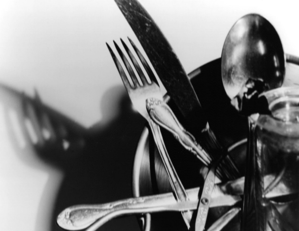
|
Shine Bright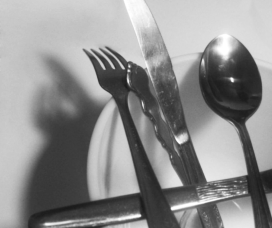
|
Untitled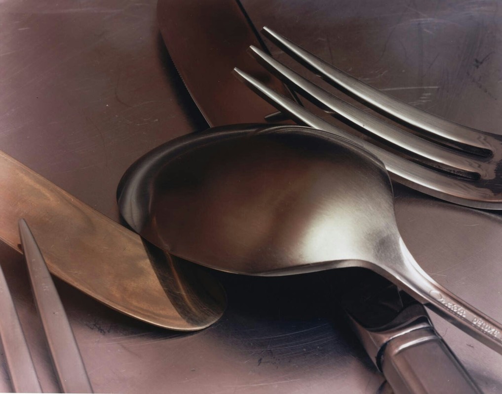
|
Spoonage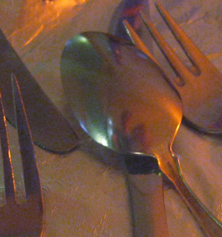
|
Untitled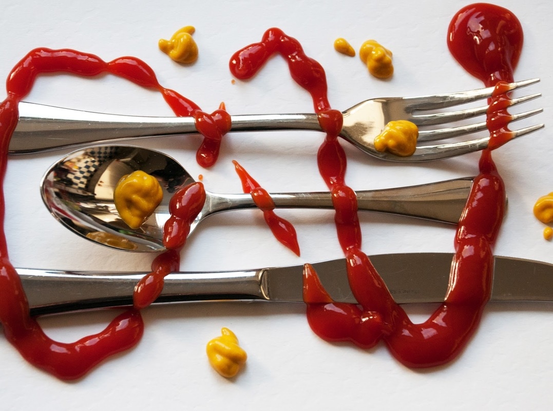
|
McDonalds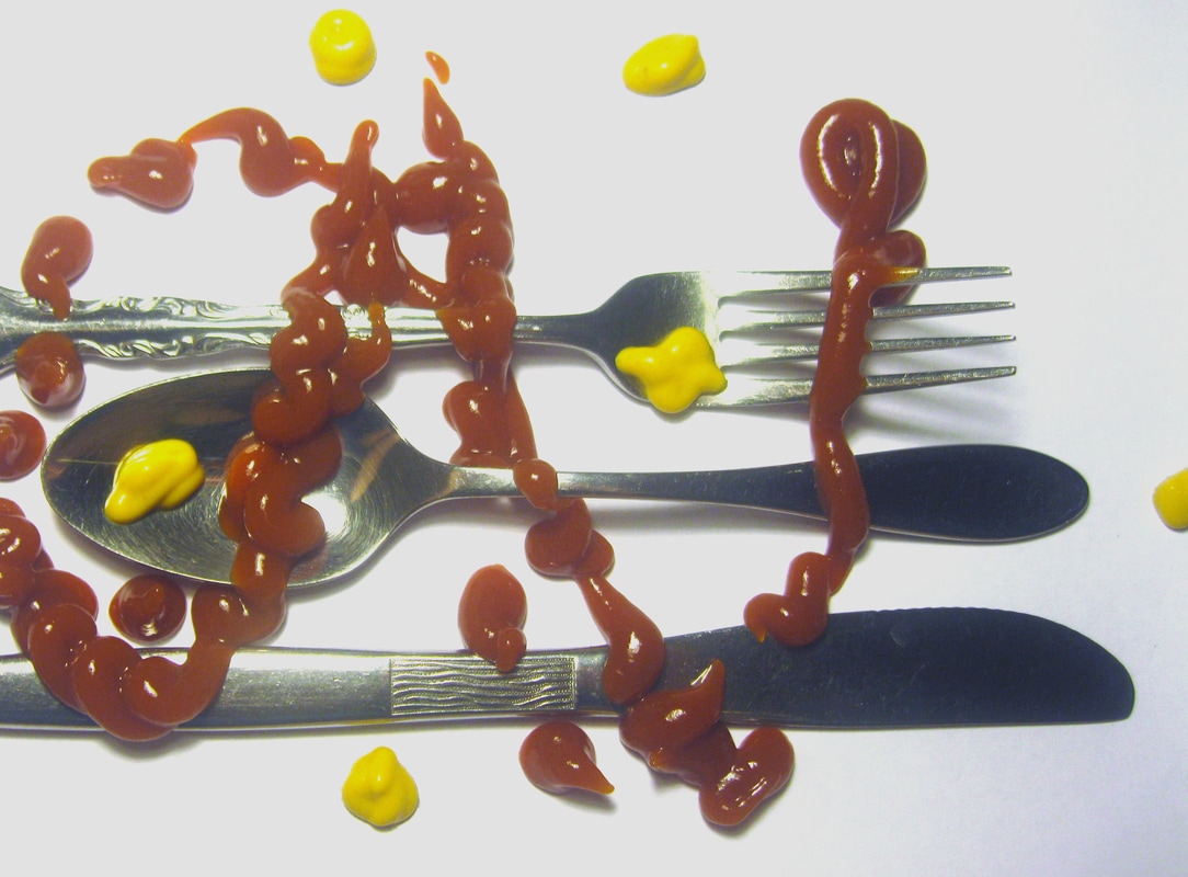
|
Name of Artist: Jan Groover
Dates of Artist’s Life: April 24th, 1943 - January 1st, 2012
Personal Background
Born in 1943, Jan Groover grew up in Plainfield, New Jersey. However, despite where she was from, Jan was everything but plain. Growing up, Jan had a very normal childhood. Her parents were both American, however her family lineage traces back to Europe. Groover studied painting at the Pratt Institute in the late 60s but eventually found that she loved photography after she bought her first large-format camera. Groover funded this purchase after winning a grant from the National Endowment for the Arts. The winnings from this gave her a great springboard which she used to launch her career. She ended up becoming a teacher at the State University of New York where she taught for several decades. Over the years, some of her pupils became notable photographers. For instance, Jan taught Gregory Crewdson, who would become famous for his elaborately staged photographs.
Style
Groover was very clearly influenced by the work of renaissance era painters. In a way, her work often looks more like paintings than photographs. I think that one of the things that Jan was trying to get across in her photos was a modern take on classic mannerism. The way that her subjects are arranged often mimic real life to a degree which other photographers cannot capture.
Philosophy
One of the most interesting thing about Groover’s work is that the meaning behind her work isn’t always clear. Often times, especially for her still life photos, there will be a variety of seemingly random objects arranged in no particular way. In a sense, I believe that this is Groover’s way of displaying the human condition. Groover is trying to show us how insignificant a lot of our choices and experiences are by removing the context around them.
Influences
Jan was infamously inspired by the work of 14th and 15th century painters. She used careful placement of light and contrast to create gritty, real, emotional images. When you look at her work, the tones and hues used very clearly evoke the same emotions which 14th and 15th century painters used. For me personally, I greatly identify with these emotions. There is something about deep heavy tones which other photos can’t emulate. When taking my photos for this project, I tried to accurately reproduce these emotions.
Sources
Untitled - https://www.pinterest.com/andreasdyrdal/jan-groover/
Untitled - http://thebluelantern.blogspot.com/2013/05/everything-was-already-there-jan-groover.html
Untitled - http://sallywoolston.blogspot.com/2010/12/theme-2-still-life-research-jan-groover.html
Compare & Contrast
In a lot of ways, Jan's images are better than mine. This is especially highlighted in lowlight areas of these images. In the second photo, I turn off my lights to create this heavy dark appeal. However, this forced my camera to film in lowlight. This handicap can be seen very clearly when side by side with Jan's images. For the other images, I feel like my deficiencies are not shown as directly. For the first photo, I should have considered the bowl color. For the last photo, I should focused on lighting more.
Personal Artist Statement
These photos are made with the intention of reestablishing how we look at silverware. Silverware is often passed over in our culture. However, I believe that these intricately created eating devices hold great potential for beauty. Silverware offers great reflections. Reflections are a great way to gain new insights into our world. By viewing the world in this new way, I hope to recontextualize some of the events around us.
